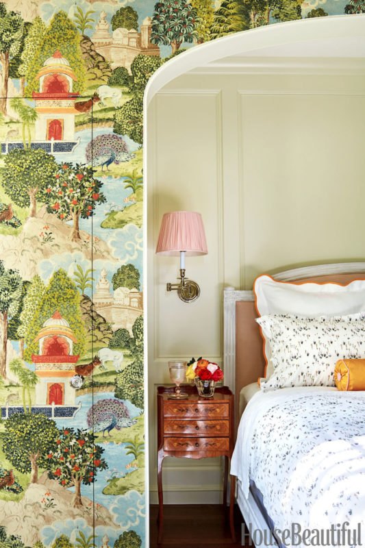
Photo by Trevor Tondro for House Beautiful
We have had a lot of friends come to stay with us this Spring, and it has been so nice having our guest bedroom properly fluffed to receive them. I realized I never posted on our guest bedroom after the House Beautiful article, which was partially because I can’t seem to find any “before” pictures of the space, but I will try to paint you a word picture.
The previous owners had used the guest bedroom as an exercise room/office and had connected it to their master suite. You could enter from the main hallway, and then walk through to their master bathroom/bedroom. With so many of our family and friends living in Chicago/elsewhere we need a private guest bedroom and so we started by separating the space from the master suite. The room itself is a nice size, with good light off on one side of the house- the tricky part was how to reconfigure the bathroom/closet space now that it couldn’t share with the master and carving out a space for a laundry room that we wanted to move upstairs.
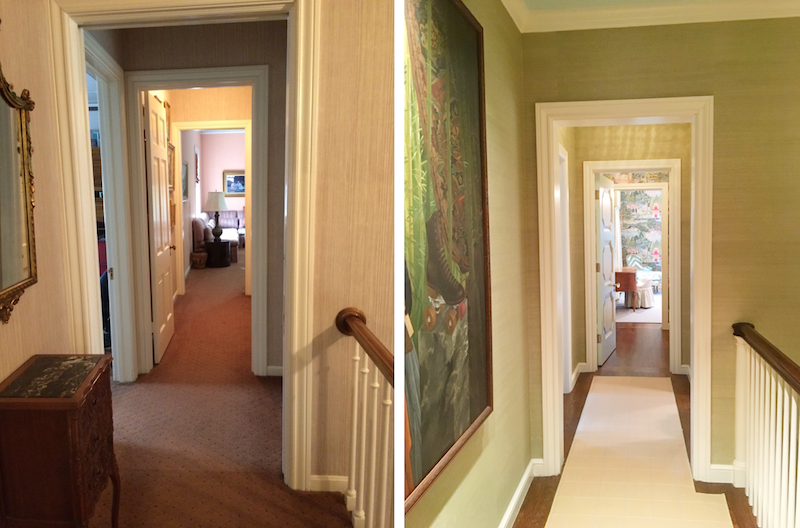
View from the hallway towards guest bedroom before on the left, and after on the right. The door to the laundry room is to the right just before the door to the guest bedroom, and the guest bath is right off the vestibule through the door.
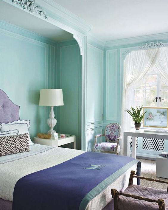
We managed to fit in space for the laundry and bath by borrowing from the master bath space, but we couldn’t seem to fit a proper closet. We didn’t need anything huge as we all have enough storage in our own closets and in the attic for any overflow clothes- but we wanted the room to be comfortable for guests who might come to stay for longer and would need a place to unpack. As I do, I turned to my pinterest boards for inspiration, and this gorgeous image:
We decided to build in two small closets on either side of an alcove for the bed. We didn’t want the space to feel too chopped up, so we “hid” the closet doors by wallpapering them and keeping the flush and paneling the alcove.
After all that- I was honestly pretty spent on the space, and in the design process for the house overall. I felt like I had used all of my creative juices in other rooms, and on the Coastal Living Showhouse that we were working on at the same time- on top of other client & Biscuit work. I should have just planned to put leftover furniture from our old house in the room and waited to really decorate it until I was re-energized, but I also wanted to power through and just have everything DONE when we moved in.
And that was a big mistake. I would show you a picture of how ugly the design I came up with was, I promise I am not too proud, but none exists and a small part of me is grateful for that- although the memory lives on in my brain cementing the lesson: If you aren’t feeling inspired JUST WAIT. If I am being honest, the other frightening part was that I was so exhausted I didn’t even realize how bad the room was until a few months later when I woke as if from a dream, rubbed my eyes clear and was like WHOA! And Pete was like, yeah. And all of my friends were like, I know.
So about a year after we moved in, just in time for the House Beautiful shoot, we re-did it and made it right. And I am so so happy with the space now it almost makes me forget what it was before. Almost.
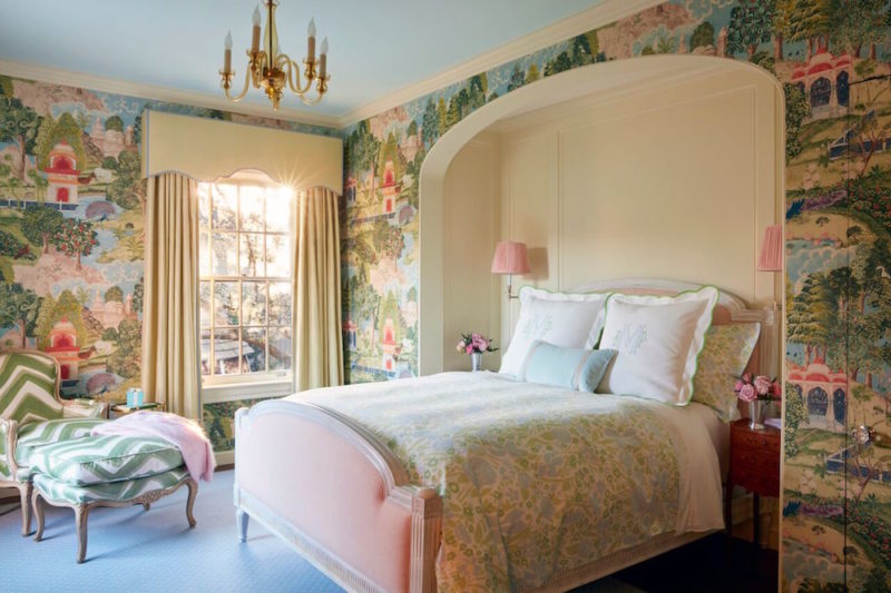
The big star, and jumping off point for the whole design, was this wallpaper by Zoffany. Sometimes I feel like I have seen all of the things out there, and whenever I find something new-to-me it is so energizing. I had never seen the paper before and fell in love- and the rest of the room came together naturally from there.
The trim and alcove I painted this barely-there shade of green, Tunsgate by Farrow and Ball, and chose a matching silk for the curtains that were trimmed with a subtle blue tape. The simple blue cut-carpet rug reflects the blue painted ceiling and helps make the room feel complete without pulling focus.
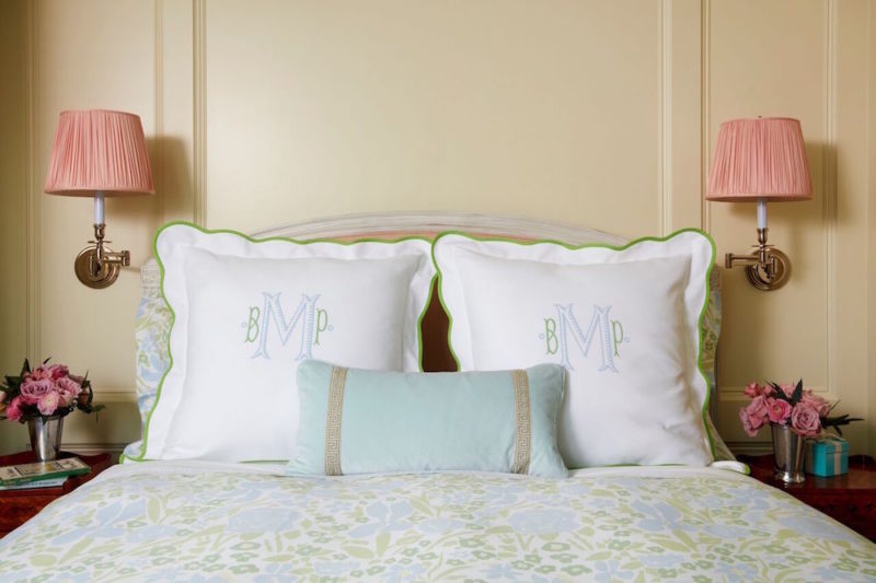
I love the Antoinette bed from Chaddock home that we upholstered in a pink linen from Schumacher- and I love love love the custom pink silk shades we added to our Circa sconces.
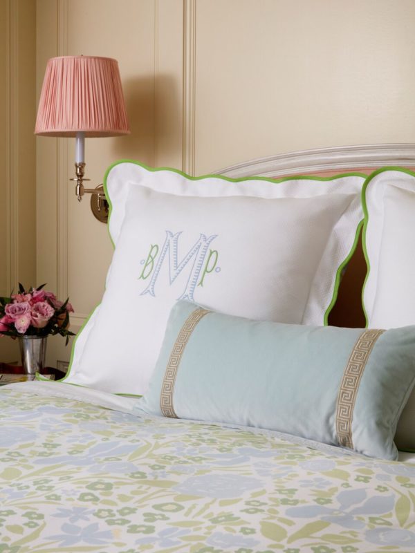
When we shot with House Beautiful we used our Wimberley Coral bedding, but when Roger Davies came to shoot the house for us earlier this year we had just received samples of our Season 6 bedding and I was dying to see the new Jenny Blue on a bed. We paired it with cabbage green pique, and a blue velvet bolster. I love how the bed looks with both- and we switch back and forth between both setups.
Images by Roger Davies for Bailey McCarthy
Sources:
Bed: Chaddock Home // Antoinette Bed upholstered in Schumacher // Barnett in Blush
Bedding in House Beautiful Shot: Biscuit Home Wimberley Coral Duvet // Biscuit Home White Pique Euro Shams in Marigold // Biscuit Home Wimberley Coral Standard Shams // Marigold Silk Neckroll from Biscuit Home
Bedding Roger Davies Shots: Biscuit Home Jenny Blue Duvet // Biscuit Home White Pique Euro Shams in Cabbage Green // Blue Velvet Bolster
Side tables: Vintage/Antique
Sconces: Circa // Swing Arm Candlestick Wall Lamp // polished nickel // Custom Shades
Wall paint color/company: Farrow & Ball Tunsgate Green
Wallpaper: Designer: Zoffany // Peacock Garden in Green/Coral
Chandelier: Vintage/Antique Petite Murano Glass Chandelier
Window treatment: Scalamandre // Dynasty Taffeta in Lemongrass Trim: Samuel & Sons // 1/2″ Aurelia Gimp tape
Chair/footstool: Antique/Vintage French Carved Painted Bergere & Footstool upholstered in Brunschwig & Fils Chevron Bar Silk Warp Print in Leaf
Rug: Langhorne Trellis Blue/White 100% Wool Wilton Broadloom from Creative Flooring Resources
You are such a genius, Bailey. I’m always so happy when one of your posts shows up in my feed. This room is stunning.
I adore this room! You did a fabulous job – wow!
I really adore your room. The wall paper is a genius idea to hide your closets. I love it, and how you’ve cleverly re-worked the space. I am a new reader, I saw a pin with your image on it and I subscribed to your blog.
Bravo- you really see to each and every detail. That wallpaper is a dream!
”
Wallpaper: Designer: Zoffany // Peacock Garden in Green/Coral ”
I don’t agree
Sincerely, Jan